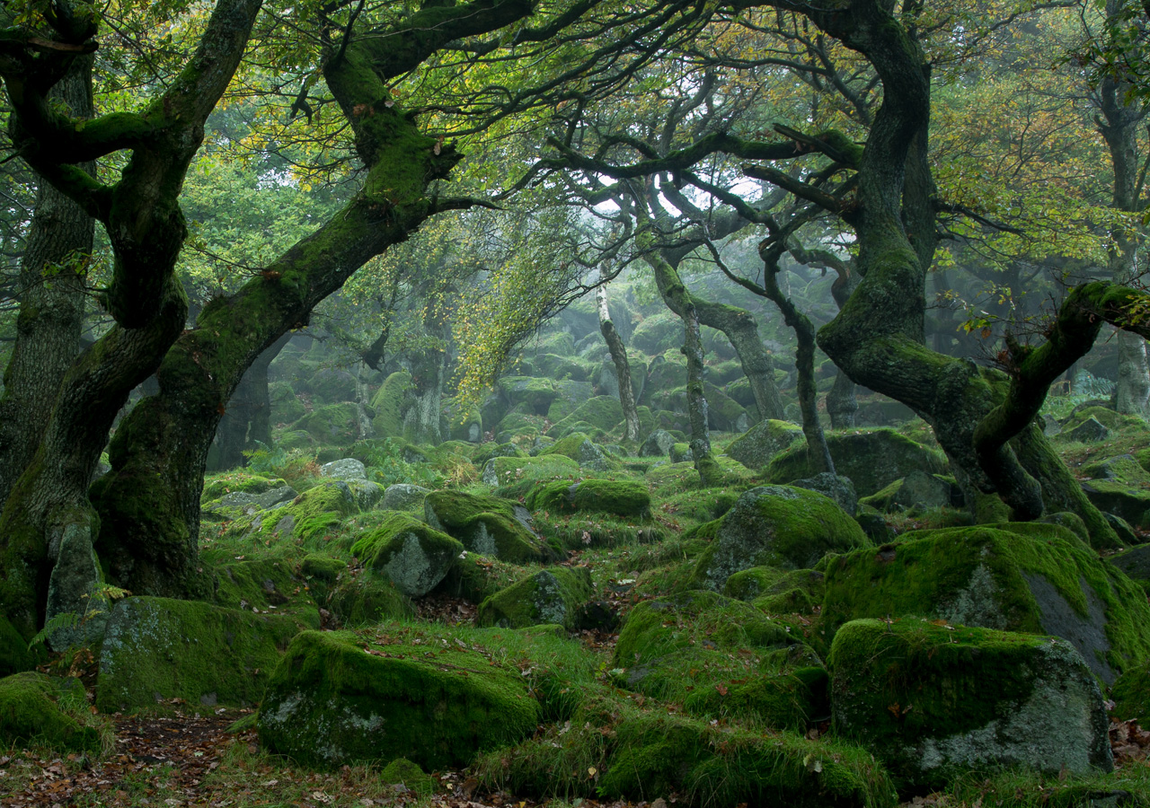
When I launched my website last year I started a series of posts called Making the Image that intended to show the thought processes and workflow that went into the selected images.
Sadly for a number of reasons these fell by the wayside. The main factor was time. I sort of bit off more than I could chew expecting to churn out quite long and exhaustive posts on a regular basis. However I've decided to kickstart the series because I think it's important and something that will really help people.
As an improving photographer I always wanted the opportunity to get "inside the head of the photographer" to understand what they were thinking, understand their process and what steps they took to get to the final image. This, more than books talking about photographic concepts, I thought would help to embed good practical advice that I could use in my own photography. Now I feel like I should try to offer whatever insight I can to others.
Making the Image
The purpose of the series isn't to show off my images, or how amazing I am. Indeed, I want to keep it honest and show you how haphazard my 'process' can be and how sometimes I just don't come home with anything I'm happy with. In fact I want to share with you as many bad images as good - they're a necessary stepping stone to better images in my opinion anyway.
It will be part process, part critique, part insight into my thinking. Hopefully it will be quite revealing and that also makes it quite scary to write about. I'm scared that it will show my process to be messy, my intention to be too shallow, my results poor. People may think I'm a dreadful photographer (they may already!). But where there is fear there is opportunity, so hopefully we will both learn from the process and I'll try to 'stay true to myself' throughout. So here goes.
Noting my above concern regarding the time past posts took, I have no more time than I had then - indeed now having a second child I have even less! However hopefully my writing has improved and I can knock these out quicker. Also I don't intend to dwell quite so much and share everything about a shoot. Let's try to keep this focused and maximise the usefulness!
A Trip to Padley Gorge
An early start last weekend found myself engulfed in thick fog at Higger Tor for sunrise. With little prospect of it lifting and some time on my side I decided to head back over to Mam Tor to see if there was a possibility of getting up top and looking down on an inversion.
Sadly there was relatively little fog in the Hope Valley itself and so that hope (bu-boom-tsh) vanished. So I decided to head back to Hathersage where the fog was thickest and descend into Padley Gorge for some woodland and waterfalls, as well as checking out how well autumn was progressing.
The first thing to say is that I still find woodland a scary prospect. Not because of the dark and the noises, but just trying to make sense of the entanglement of branches in a photograph. Usually when rendered as a 2-dimensional image trunks and branches overlap and just create this confusing mess.
You might see where two trees look awkward next to each other, adjust your position or your focal length to fix it only to create another pair of awkward trees. I find it to be a frustrating and never ending puzzle at times. Sometimes I wonder if, having given it a go, this ongoing awkwardness is a sign to walk away and find something a little less hair pulling.
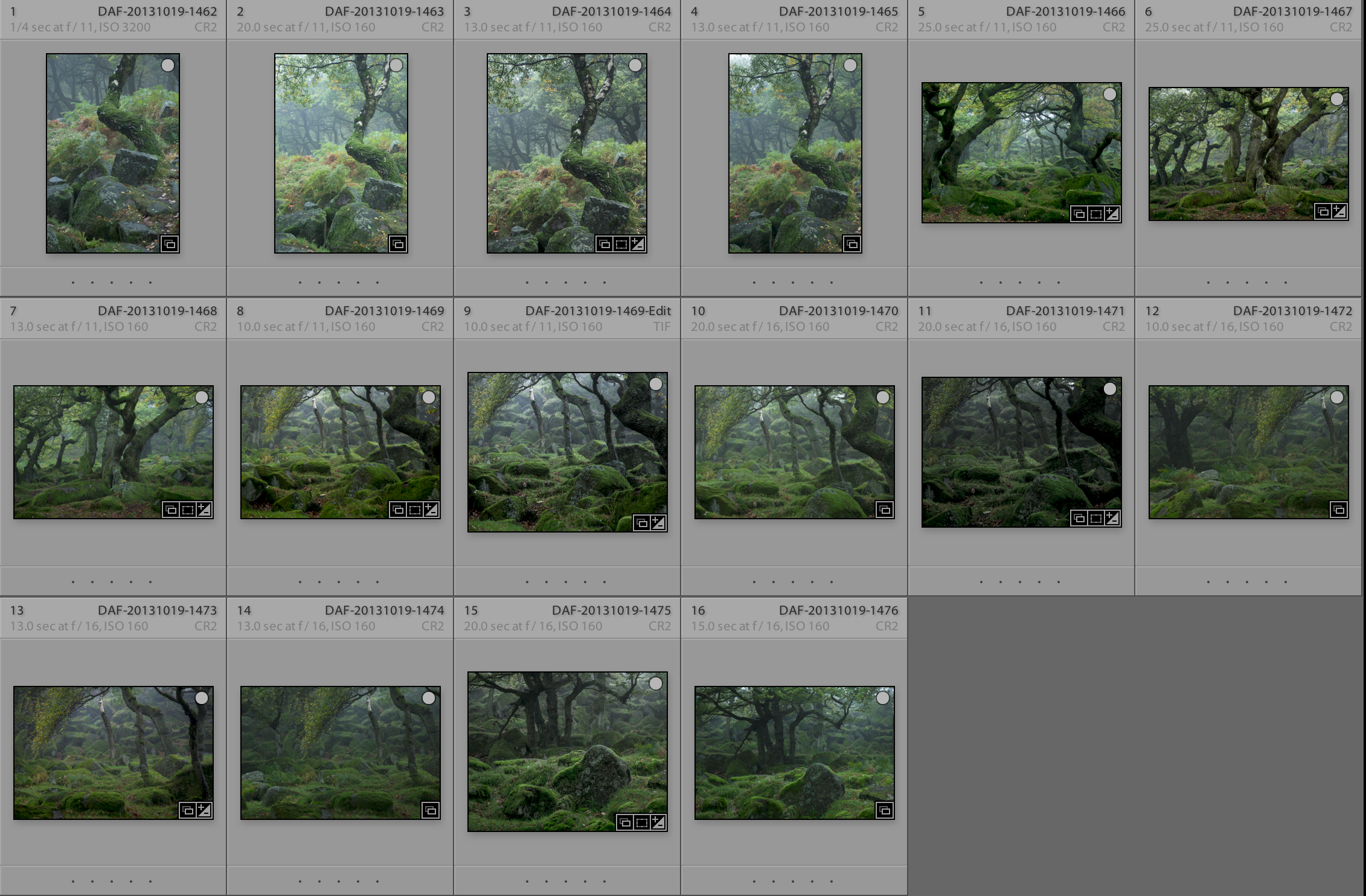
Here's a sequence of 16 images I shot in Lightroom.

Initial Shots
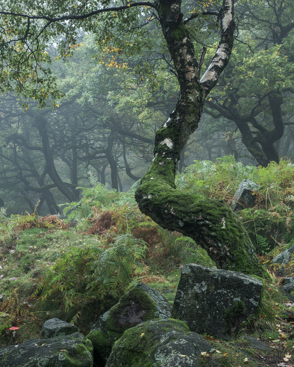
The first 4 shots are where I came across this lovely twisty turning tree with only the foggy woodland beyond that I thought would help bring it out. I quite liked the cubic rock at the base of the tree giving a soft v hard contrast between the organic shape of the tree and the perhaps man carved rock.
These are shot at 58mm. If I've learned one thing it's that shooting wide in woodland is a real challenge - it brings in too much extra clutter, tends to bring in a lot of sky (which is best avoided most of the time I think) and leaves more distant trees as indiscreet but nonetheless messy background subjects.

I'm not happy with this image. I can't always put my finger on exactly why I don't like an image but overall this one leaves me feeling pretty unmoved. Things that I don't like about it:
- it feels bottom heavy, literally. A lot of rocks, not a lot of foliage.
- perhaps the most interesting background tree in terms of foliage is behind the 'Y' of the foreground tree
- the foreground trunk snakes around the background trees but doesn't provide a strong frame
- the horizontal branch across the top I felt provided a nice conclusion to the top of the frame. Now I think it's a bit too straight against the otherwise undulating tree trunks
- the red toadstool is great but it's tiny and it's too far away from the point of interest (did you even see it? Bottom left!)
- I might be happier if the tree was to the left of the frame so that the curve of the tree lead you out then back in to the distant trees. Here it feels like it's in conflict rather than harmony.
Ultimately it just doesn't have enough going on to hold my interest.
Turning Around
Having taken this one I turned behind me to find the next sequence of shots. There were some lovely gnarly trees, with what felt like an eerie pool of light towards the back of the scene. The whole scene had a lovely luminance to it that I got quite excited about.
The next few shots are pretty much sketch shots - shots of the scene in front of me so that I can then start working out what I want to include and how best to depict it.

I originally thought I was drawn to the central trees flanked by the group of trees to the left and lone tree to the right. But the gap between centre and right is too large to be coherent, and the left hand side feels like it's falling off and even more disconnected.

Changing position slightly I start to focus on the middle clump of trees, ignoring the right, and I'm really liking the angular rocks to the front. But the composition feels muddled. I've got a clump of trees to the left, the focus on the central group of trees but not much going on on the right. In fact, I feel like the arching branch of the right hand tree is leading my somewhere - but in this shot it's just taking me out of frame.
I change position again, deciding to focus on the apparent luminance in the distance, as well as the white bark of the tree at the back and the colouring in the overhanging branch to the left of frame. Why I didn't use the arching branch from the previous frame at this point is anyone's guess!

Firstly I love the luminance on the moss on the rocks and quite like the arrangement of rocks towards the bottom right corner. However the tree coming in from the right of frame is very large and dominant. Add to that the tendency for the other trees (all towards the right of the image) to lean to the left then the whole image just feels heavy on the right and feels like it's pushing down on everything on the left as if about to topple over. The image really needs something on the left to balance the visual mass and feeling of downward pressure on the right. This is supposed to be a relatively serene image but it feels too oppressive as it is.
One other annoyance - common across these images - is that there are two trees that are pretty much central where the trunks sort of merge together. I was aware of this whilst making the shot but separating them seemed to cause other problems. For example, I lost the white bark, or the large trunk to the right started pushing too far into the frame. I wrongly chose to make them overlap more to make them appear more like the same tree, but this just looks weird in the final frame and was a bad decision.
I've then tried a few different ways of processing these images trying a cooler treatment, warmer brighter treatment and then a lower key treatment. I'm not sure about any of them but it's interesting to note how much these different ways of processing pretty much the same image alter the feel. Post-processing really does have an important role to play in affecting our reaction to the final image.
I then tried eliminating the large trunk to the right, but I still don't feel like the balance between left and right works. There's just not enough on the left to support the rest of the image.

Moving Round A Bit More
Finally I moved round to the left to see what it would look like to put the white bark to the left of the overhanging branch. Instead of that shot, I found these interesting rocks and focused in on them with a semi-silhouetted clump of trees.

With the luminance in the top right, the interesting rock shapes and the relationship between the foreground rocks and midground trees I thought I'd be happiest with this image.
But the downward angled branch on the left of the trees is too graphic and distracting to my eye. I also feel like the trees are a bit too 'on top of' the foreground rocks. Taking a few steps to the left would have provided a more engaging composition by creating a triangle between the foreground rocks (bottom right), trees (mid left) and luminance (top right). As it stands the left handside - further detracted by that downward branch - feels lost, and my path through the image is too vertical from the rocks to the trees. Oh well.
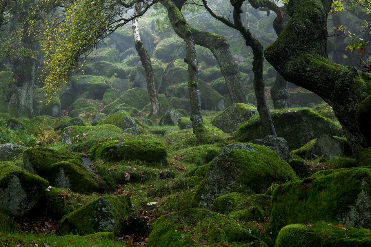
To finish, in post processing I choose to return to an earlier frame and more heavily crop to remove some foreground and the left hand clump of trees.

This leaves (what was) the middle clump of trees to the left and the gnarly tree to right providing an archway through to the luminance, overhanging branch and white bark beyond, supported by a not-too-heavy group of moss covered rocks to the bottom of the frame. I think I like this one but still feel like there's a balance issue between left and right. The gap above the right hand tree revealing coloured foliage is distracting to my eye but I can't crop further without hacking off the base of the trunk which is probably a bad compromise.
I think this is the 'winning' shot from the series. Again why I didn't pursue this composition in the field is a source of befuddlement! I'm not totally happy with it. It definitely lacks the magic I felt at the time and it feels a little disjointed. I feel like I should have done better, and certainly regret dashing to Bolehill Quarry (20 mins each way) when I only had an hour left on site. Some you win, some you lose.
One final point of interest is that there's a bit of variation between each of these images - all of them shot within a few feet of each other. At least I tried to work the scene to my advantage rather than taking one shot and moving on. I always find it amazing how such small movements, even a matter of inches, can completely transform a scene.
What do you think? What would you have done differently? Did you find this post helpful? Please do let me know.


