Of all image imperfections my personal pet hate has got to be the ‘halo’. Halos are bands of light (or dark) that follow edges in an image. They are most prominent along high contrast edges such as when the land meets the sky. As with other anomalies, halos are to me like signposts that say the artist hasn’t paid enough attention to detail. It’s quite often in the details that a great piece of work is elevated over the mundane. Of course our goal isn’t merely to create technically correct photographs, but such imperfections should be calculated creative decisions rather than demonstrating a lack of care or craft. Anything that doesn’t seem ‘quite right’ in an image gives the viewer a chance to escape and question the making of it rather than enjoying and absorbing it.
I feel that part of my goal is to shut the door to the outside world and let the viewer enjoy the world which I have created for them. Note that I say ‘created for them’; the image doesn’t have to be realistic or accurate. Rather I feel it has to have believability within one’s imagination. Technical mistakes break that illusion and cause mistrust.
Halos are caused by many different things and take on slightly different forms depending on the cause. There are five types I’ll talk about in this post:
- Chromatic aberration
- Sharpening
- Excessive Clarity
- Spillover
- Luminance Changes
The first two are pretty easy to deal with.
Chromatic Aberration
Chromatic Aberration is caused by a lens failing to focus all of the different colours onto the sensor at the same point. This results in a ‘fringe’ running along particularly high contrast edges which is usually red or cyan. It is most prominent when using poorer quality lenses but even top of the range lenses exhibit the problem to some degree.
When an image is sized for the web you can sometimes get away with some CA. However I find those that escape attention online reveal themselves in print with a strange coloured ‘glow’ along the edge. The good news is that these are super easy to fix. In Lightroom (or Adobe Camera Raw), go into the Develop Module and look for the Lens Corrections panel on the right hand side. On the Basic tab is an option for ‘Remove Chromatic Aberration’. Ticking this will totally remove the problem ninety nine times out of a hundred
Sharpening
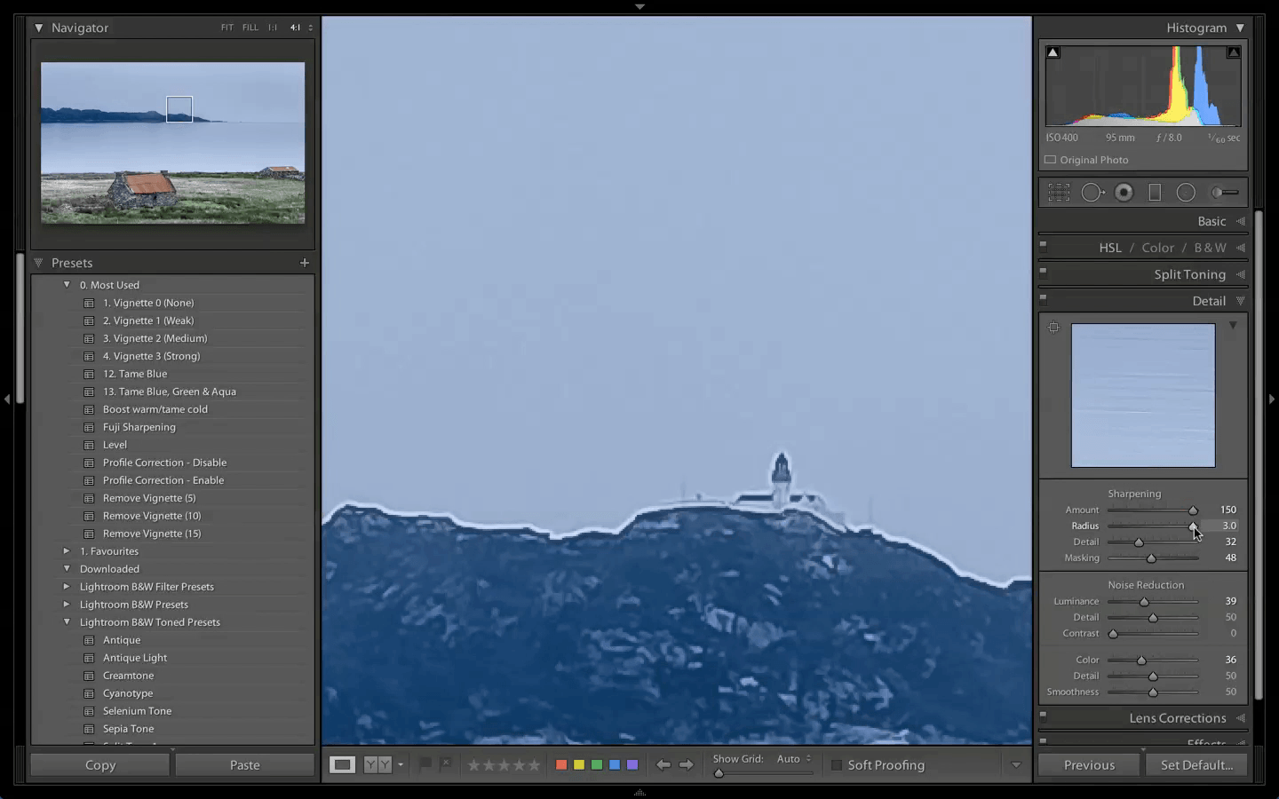
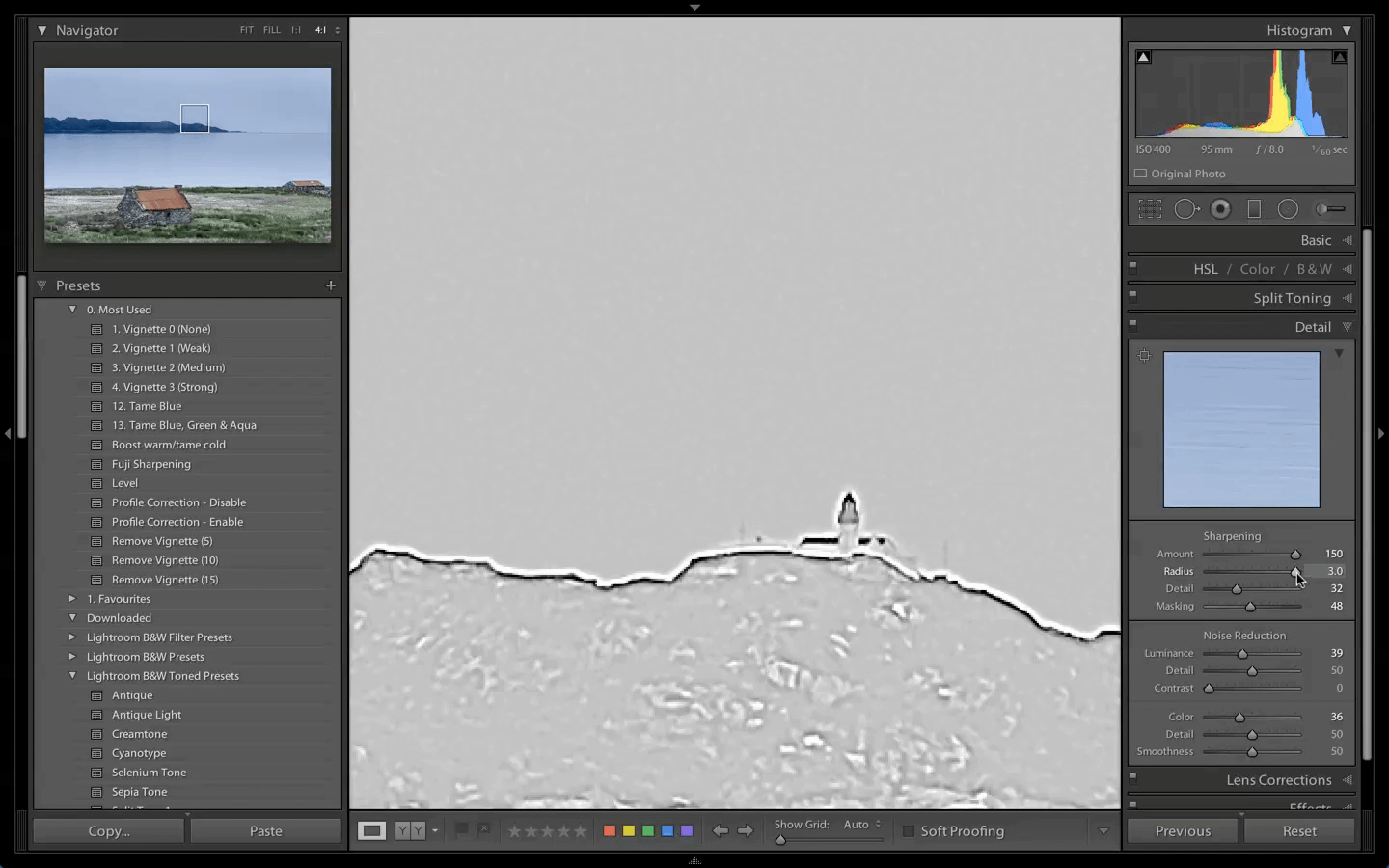
Sharpening basically increases the contrast of edges at a micro level, darkening the pixels on one side and lightening the pixels on the other side. As you apply more sharpening (using the Amount slider in LR) then the degree of darkening/lightening applied to the edge increases. In LR the Radius setting determines how many pixels from an edge should be affected by the sharpening.
Halos appear when the Amount is very high causing the edge pixels to be over-lightened, causing a bright glow along the edge. If using a high Radius setting the width and so the prominence of this glowing halo will increase. It’s worth noting that there is a corresponding dark halo along the darker side of the edge but this tends to be less obvious.
The solution is an easy one; reduce the Amount and/or Radius sliders until the halos disappear (best viewed zoomed in at 1:1). Although different images react differently to sharpening, the Amount slider is usually the chief culprit so it’s worth exercising caution once you get to 60 or so. The default Radius value of 1.0 is reasonable and most people don’t tend to play with it so it’s less of an issue. If you find you have an issue try dropping it down to around 0.7 and seeing if that improves things.
Excessive Clarity
The third type of halo is to me much more obvious when looking at an image. It may have a proper name, but I’m just going to call it an ‘edge contrast halo’ as it is chiefly contrast changes along an edge that cause the problem. This may sound similar to what I just talked about regarding sharpening, and that’s because approach is very similar but with a much wider effect. Indeed over sharpening could be considered an ‘edge contrast halo’ just with a relatively small radius.
Where the previous halos may be restricted to a few pixels either side of an edge, these edge contrast halos are much wider, taking in tens of pixels. The main source of these types of halos is use of the Clarity slider in Lightroom/ACR. Clarity is a contrast enhancement that’s localised along edges - hence it’s called a local contrast enhancement. I often think of Clarity as being like sharpness that you can see at the big picture level without zooming in. The adjustment will increase the contrast of edges to give the illusion of greater detail and sharpness and is much more obvious. This can be a good thing as our eye is more strongly drawn to areas of greater detail. Judicious use of Clarity can help to push and pull the eye to areas of the image we want the viewer to dwell on.
As with sharpening it’s when Clarity is used with too high a value that the dreaded halos appear. They tend to be less glowy than other halos but cover a wider area. To understand what’s going on, let’s look at how you would create a similar effect to Clarity within Photoshop. To perform a local contrast enhancement in Photoshop you use Unsharp Mask, the same tool - paradoxically! - that’s often used to sharpen an image in PS.
As discussed when sharpening we apply a reasonable Amount of sharpening in a small radius (0.7-1.0) to increase perceived sharpness at the pixel level. When performing a local contrast enhancement using the Unsharp Mask however, you use a low amount (5-20%) with a wide radius (30-100 pixels) - the total opposite of what we do with sharpening. This means the adjustment increases contrast over a wider area along the edge albeit with a less pronounced effect.
As with over sharpening too high a value means one side of an edge becomes much darker and the other much lighter causing halos. The light halos are more obvious but it’s worth checking for dark haloes along the edge of e.g. mountain ridges.
Let me demonstrate with an image from Talisker Bay on the Isle of Skye that was causing me some Clarity-induced halo problems. Here’s a version of the image with a number of adjustments but before applying any Clarity. It’s ok, but the water doesn’t demand the viewers attention in the way that I would like. Rather my eye is drawn to the white water across the middle of frame (not so good) before moving up to the sea stack (which is a good thing). It’s definitely lacking some ‘oomph’.
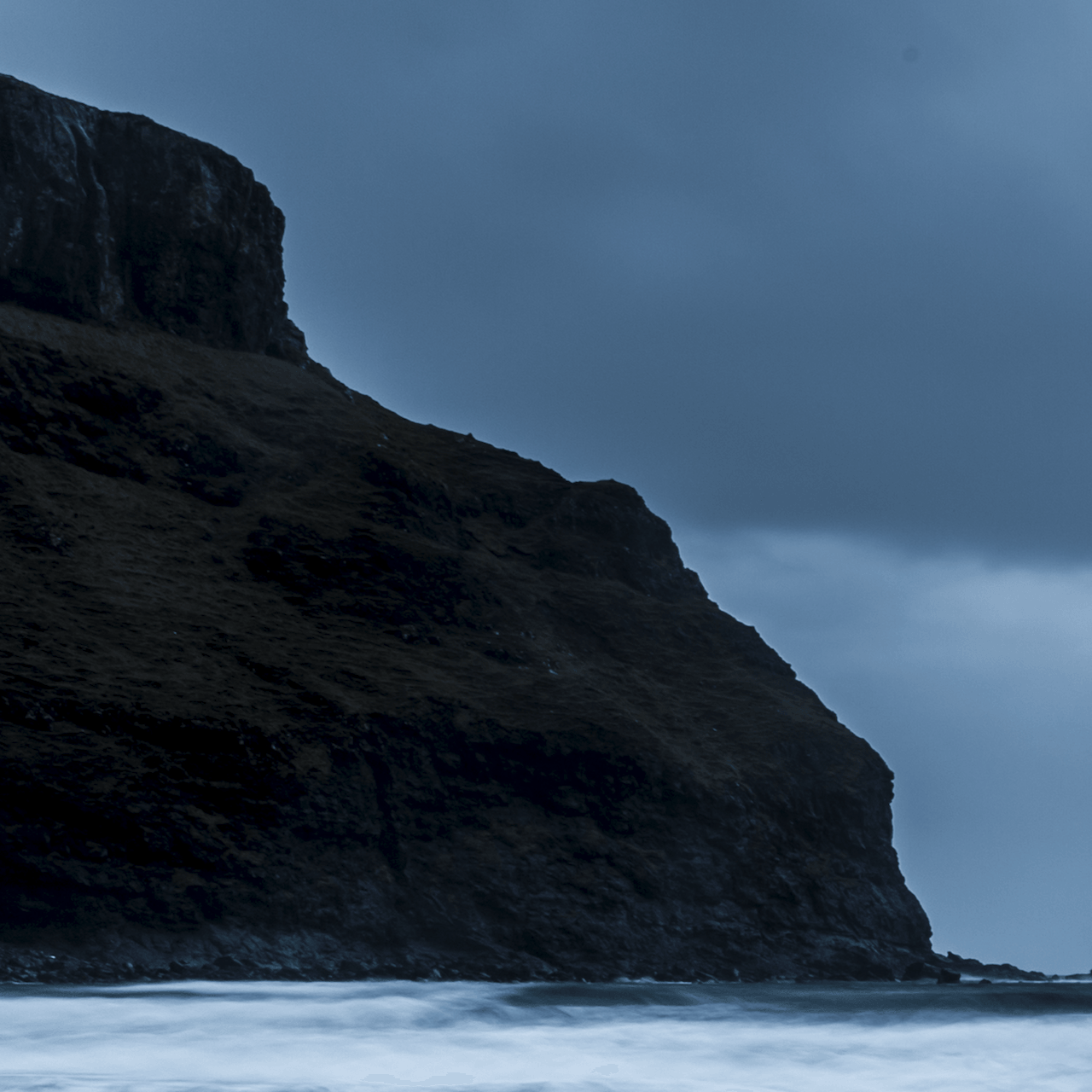
Knowing that Clarity will really help draw out the beautiful streaks and patterns in the water, here’s a version with a somewhat over the top Clarity+100 adjustment. That’s much better! The local contrast enhancement in the foreground ripples has done a great job of making them a prominent feature, and I feel my eye is now pulled between there and the sea stack and bouncing quite freely between those two objects. The sky also has much better definition.
However now take a look at the top left hand corner. There’s an unnatural bright glow in the sky above the cliff. This is one of the halos I’m talking about. It’s not there in the non-Clarity version, so it’s all Clarity’s fault. Though there are no glowing clouds as the rock face approaches the sea to the left of the sea stack, there’s a very bright edge along the rock face that has that look of over sharpening about it.
I like to think of these halos as my mine canary, warning me that I've pushed my post-processing too far.
There are a few solutions.
The first, quite obviously, is reducing the Clarity slider to a lower level. This is often part 1 of any solution if not always the full solution.
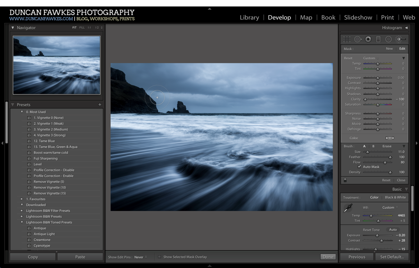
The second solution comes by virtue of how Lightroom works. Rather than making pixel level changes, LR keeps a list of instructions it uses to adjust the image. This means that we can make and stack up several adjustments quite happily. For example if I set a global Clarity adjustment of +100 and then paint with a Clarity -100 adjustment then LR does the maths (100-100=0) and knows not to apply any Clarity in that area. If I wanted some of the adjustment to come through, I could use a brush with Clarity -75 to leave a 25 point Clarity adjustment in the painted area.
So in this image, I can completely remove the halo caused by Clarity +100 by using a brush at -100. The temptation may be to zoom in to 1:1 and apply the negative clarity using a small brush size just along the edge itself. In my experience this give you the opposite problem of a dark halo along the edge, where the negative clarity has removed the halo, but it touches the area above where Clarity is still in full effect. I find it’s usually best applied with a wider and fully feathered brush to give it a nice blend with other areas that aren’t being adjusted.
An alternative - and arguably preferable approach - is to apply at most a very small global Clarity adjustment. Up to 20 points gives a nice lift to an image without introducing too many problems. I can then use an adjustment brush with a positive Clarity adjustment to paint Clarity precisely where I want it - in this case in the ripples and the waves, and the clouds. This also avoids the other undesirable byproducts of the global Clarity adjustment I performed earlier which brought out too much detail in the cliff face and over brightened the white water.
Spillover
While we're talking about adjustment brushes, another common halo comes from heavy handed use of adjustment brushes that I call ‘spillover’. This is where an adjustment is made but not confined within the appropriate area, causing other parts of the image to be incorrectly affected. Most often this might be brightening a mountain ridge, a tree or a rock using a brush with a positive Exposure adjustment. This might brighten the required object, but often results in a patch of sky being wrongly lightened.
There are a few ways to deal with this one. The first is to recognise the warning signal. When editing images in LR I will use the "Before / After” toggle (press ‘/‘), undo/redo or the history panel to get a sense of where I came from. This normally makes particularly heavy handed edits pretty obvious. Alternatively if I take a break and come back to the image later I may see problems I previously missed.
If the spillover is very obvious it normally means the adjustment is being overdone in the first place so I’ll start by toning it down a touch.
In Lightroom you can use the Auto-Mask option for the adjustment brush to limit the brush from going over an edge. In my experience this is a bit hit and miss, with some spillover to similar tones in the background possible and often creating a dappling effect within the object where some tones fall outside of the mask. It can be useful to toggle the Mask Overlay (press O) to see where the adjustment is being applied.
To tackle the actual spillover my preferred approach is to use a decent sized brush with 100% feather and try to paint within the object, not getting too close to the edges. Only the feathered part of the brush should ever fall outside of the object. I then switch to a slightly smaller Erase brush with a lower flow (e.g. 50), still fully feathered, perhaps zoomed in if it’s a tricky edge, and and start erasing the adjustment outside of the object. Ideally I want to remove all of the adjustment from the background, and I use the feathering to reduce it slightly along the edge of the object. I’m not sure why I prefer this ‘apply and erase’ method, but I find it easier than trying to accomplish the same adjustment in one go.
Luminance Changes
Finally for this post Lightroom's Hue-Saturation-Luminance (HSL) panel can also cause you halo problems. The most striking example is where you have an object with a bright blue sky behind. A common adjustment is to lower the luminance of the Blues to darken down the sky to give it more ‘pop’ (sort of mimicking the effect of a polariser). However if you go too far with the adjustment a prominent line will appear along the edge where the edge isn’t quite as distinct as we would like. Even with sharp edges, the edge pixels tend to be a mix of the land and the sky. The luminance reduction only adjusts the purer blues leaving this transition zone behind as a halo (this becomes worse if the edge is slightly out of focus). You may also see this when doing B&W conversions if you drag the luminance of e.g. Blues down in the B&W mix it will turn the sky very dark but can leave a bright halo along the edge. Exercise caution and keep an eye out for these with particularly large luminance changes in the HSL/B&W panel.
Phew!
We’re done. Though lengthy, hopefully the above gives you an idea of things to look out for and suggestions on avoiding them. It’s impossible to cover every eventuality in a post but I think I’ve knocked off the most common culprits. My final trick is to use an adjustment brush with negative Clarity. As well as undoing an overly strong Clarity adjustment it can be very effective in helping soften other halos, bright patches and details that might pull the eye too strongly.
Do you recognise these issues? Are there any problem halos you’ve struggled with that the above solutions don’t help with? I’d be interested to hear about them.


