In years gone by judging exposure was a bit of a dark art. Various techniques such as the Zone System came into being to help photographers to evaluate a scene and how it might expose on film.
Fortunately with the advent of digital photography it's possible to get a good exposure with much less experience and judgement. One key advantage of digital is that we have instant feedback via image review on the LCD on the back of the camera.
However referring only to the image review can lead you astray. I'm not sure what they do or rather why they do it but images on the back of the LCD have a tendency to make our pictures look 'Awesome!'. However that 'awesome' image often turns out to be 1 or 2 stops underexposed when you get it home. It looks lovely and bright on the LCD but in Lightroom it is dark and in need of some serious work (or binning). In short the LCD tells lies!
This is where the histogram steps in. The histogram tells the truth.
The histogram is basically a bar chart that shows you the various brightness levels that are in the image. Rather than relying on the image review we can look at the histogram to tell us how bright the image will actually be when we get home and if we need to alter our exposure settings in the field.
It tells you if the image is too dark, too light, or has high contrast. Most cameras allow you to show the histogram next to the image during image review so have a look in your manual to find out how to display it.
What does a Histogram Look Like?
At first glance interpreting a histogram may seem like a black art itself but it's actually pretty simple.
Below you can see a fairly typical looking histogram. Underneath the histogram I've placed a gradient that shows the tones from black to white that map onto the values of the histogram. Starting on the far left we have blacks then shadows, mid-tones, highlights and finally whites on the right edge. The height of the graph at any given point shows how many pixels in the image have that particular tone.
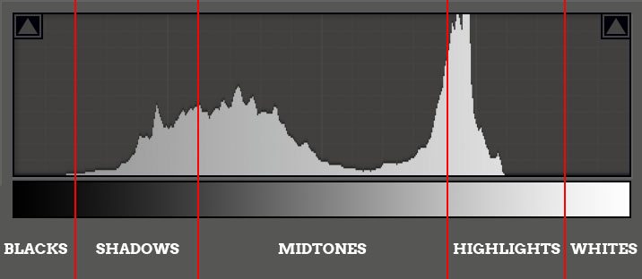
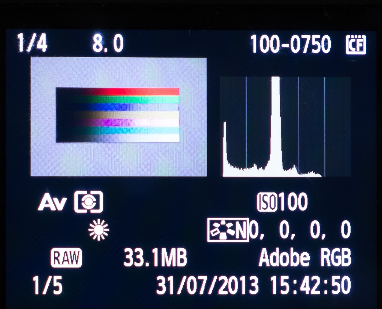
I've taken the histograms from this post from Lightroom as it's easier than trying to take them from the back of the camera in the field. To the right you can see what the image review with histogram looks like on my Canon 5D Mark II.
To try to make this a little clearer I've imported a test image into Lightroom. It's the same gradient as above with pure black on the left and pure white on the right.
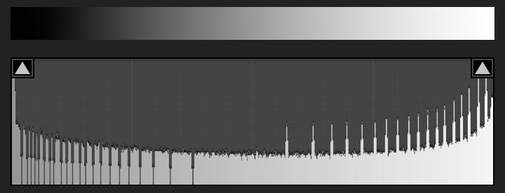
You'll see that the histogram is pretty flat (ignore the little spikes) covering all of the tones from black to white. If we look at the next image I've actually cropped the blacks and the whites out of the gradient (Lightroom's histogram reacts to what's 'in' the crop).
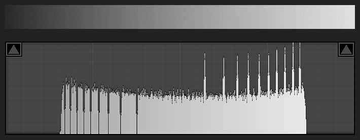
You can see here that without blacks and whites in the image the histogram covers a much narrower range - shadows, mid-tones and highlights.
As an aside for Lightroom users the triangles in the corner of the histogram are clipping indicators. I'll cover clipping in a moment but you'll note that in the full gradient they are illuminated to indicate clipping of the blacks and whites. Clicking on the triangles (or pressing the 'J' key) will show areas that are clipped in the image, with clipped blacks showing blue and clipped whites showing as red.
Let's consider a couple of problems that the histogram can help us to deal with better than using the image review on the back of the camera.
Underexposure
Here we have dramatic underexposure. Almost all of the image data resides in the Black and Shadow regions and the image is incredibly dark.
If we go too far to the left such that the graph is touching the left hand side then parts of the image have turned to featureless pure black with little hope of us being able to -re-introduce detail during post-processing.
Often images like this can look amazing on the back of the camera and I've been fooled by that in the past. One particular effect of underexposure (not evident in this image) is that it tends to make colours look much richer and more saturated. On the back of the camera that looks amazing, but the histogram is there to tell us we have a problem.
If the histogram is predominantly towards the left of the graph with nothing towards the right this often points towards an underexposed image and disappointment when we get home. To remedy we need to increase our exposure. Most of the time I would be using Aperture Priority (Av mode for Canon, A for Nikon) and so my solution would be to dial in some positive exposure compensation (EC), in this case at least +2 (this image is so underexposed that the camera wouldn't underexpose this scene that much).
Note that in real life scenes do often have areas of black where our eyes can't make out the details in the shadows, so some blacks in our images are not only fine they're actually quite desirable. We don't need to worry too much if some of our histogram falls off the left hand side, we just don't want all of our image doing that or being on the far left.
Overexposure
Perhaps obviously the other big problem the histogram helps us with is the opposite of underexposure - overexposure.
Here the image has been totally overexposed. Everything is very bright and washed out. Some parts of the image have turned to pure white (often known as 'blown highlights'). Again you can see the illuminated triangle in Lightroom indicating highlight clipping.
As a sidenote you'll note that we talk about 'highlight clipping'. Most literature and cameras reference the brightest tones as highlights yet Lightroom calls this region whites. I think this is a little confusing and to me highlights are a subset of whites (the very brightest). Anyway be careful that it doesn't catch you out in Lightroom!
If the histogram falls off the right hand side of the chart like this then those areas lose all detail - they become pure white. If we were to darken the image in post-processing we would see big white patches circled by weird looking colours that you've likely seen for yourself. Of all the things we want to avoid with digital photography it's blowing those highlights as it creates awful looking featureless patches in our image that even a casual observer will identify as a technical flaw.
As well as seeing the histogram hugging the right hand edge like this most cameras provide a 'highlight clipping warning'. Commonly called the 'blinkies' they show the areas of the image that have had their highlights clipped.
Note if you use RAW these blinkies (and indeed the histogram itself) aren't 100% accurate and you often have a little more space to the right before the highlights truly clip. Consider them a useful indicator rather than the absolute truth.
To remedy we do the opposite of underexposure. If I'm shooting in Aperture Priority I would dial down my Exposure Compensation by -2 to get a better exposure.
Sometimes some blown highlights are ok and in fact are unavoidable. For example a bright reflection on glass or metal and even the sun itself are just too bright to capture detail in and so we just let them blow out. But using the histogram helps us to make sure everything else is kept in check. Similar to an underexposure we should be wary if all of our peaks are in the right hand side of the histogram with nothing to the left.
High Contrast
The next image is very much faked to show another common problem - where there's a large difference in contrast - from very dark to very bright.
You can see here that we have a histogram that's falling off the left side and the right side of the chart. This is telling us is that it's physically impossible for the camera to fit the dynamic range (contrast) of the scene into a single frame. This is a common problem when taking photographs during the day where the land is relatively much darker than the sky. The problem becomes much worse at sunrise and sunset where the sun approaching the horizon makes the sky in that direction very much brighter. Without some jiggery pokery the only way we can retain either blacks or whites is by making the opposite end of the histogram worse which we don't want.
There are typically two ways that we deal with this situation. The first is to use neutral density graduated filters. These are dark in the top half and clear in the bottom half thereby reducing the difference in brightness between the bottom (land normally) and top (sky) of the frame. These come in various strengths (2-stop, 3-stop being normal) and abruptness of transition (hard or soft). If this is the route you take then I find that a 2-stop hard GND is the most useful.
Alternatively you can take multiple exposures - one for the whites and one for the darks - and then merge them together in post-processing. How to achieve this is beyond the scope of this article but you may find this post useful.
A Better Looking Histogram
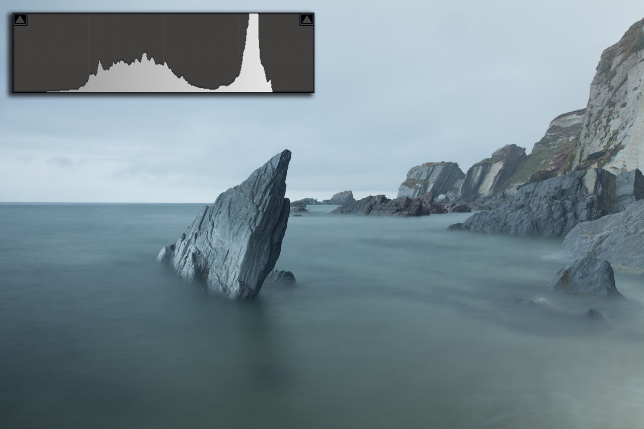
The histogram here is fairly usual of a landscape that includes land and sky, and shows a better exposure for this scene.
The relatively darker land is represented by the lefthand peak on the border of the shadows and the lower mid tones. The relatively brighter sky is represented by the right hand peak in the upper mid-tones and highlights area. The histogram has a reasonable spread of tones from the shadows through to the mid-highlights.
Even so the histogram shows that the image is lacking in contrast. You'll see that we have no peaks in the Blacks, Whites or upper Highlights. You often see this when processing RAW files where they have no contrast adjustments applied in-camera.
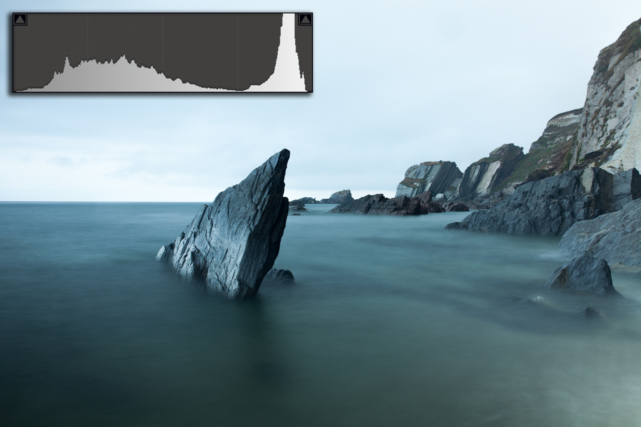
In this next image I have improved the contrast by pulling the left hand edge of the graph towards black and the right hand edge towards white to create a punchier, more dramatic result. Note that many scenes don't actually contain a wide contrast range running from black to white, and so if we push the contrast too much the image begins to look unnatural. There's an argument that the below image has had its contrast pushed too far.
The 'Perfect' Histogram
Before wrapping this post up I should probably point out that there's no such thing as a 'good histogram' in an abstract sense. You can't ignore the image itself and decide if the exposure is good just by looking at the histogram.
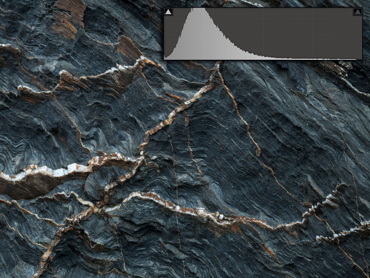
The histogram, quite obviously, represents the image data and so is completely dependent on the contents of the image and the the tones within it. It's quite possible that a histogram might look like that of an underexposed image but may in fact represent a perfectly exposed image if it contains a lot of dark tones. Similarly some scenes may look overexposed when in actual fact they just contain a lot of brighter tones.
The histogram isn't a magic tool that boils photography down to matching a 'perfect' histogram. We still need to develop an ability to read the scene and its tones to understand what a good exposure would look like. The histogram is a fantastic tool in helping to develop this understanding, so it's a bit of a win-win.
...And fortunately there's a reasonably foolproof way to use the histogram to get a consistently good exposure. That will be the subject of the next post.

