In this Making the Image post I’m going to take you to Torridon in the Scottish Highlands. The wee road to Diabaig weaves its way along the north shore of Loch Torridon before climbing up the lower slopes of the Torridon hills. The view of the mountains to the south across the loch is quite beautiful.
Two Trees
Just above Inveralligin the road passes across a large sandstone plateau. There’s little on this plateau that immediately captures your attention as a photographer. It’s mostly grass and heather with few rocks or other features and so it’s easy to drive by. However on the edge of this plateau are two little rowan trees. And like most photographers I’m a sucker for a lone tree.
Coming from the east the first tree is the larger and more shapely of the two. However it sits below the edge, and with a telegraph pole and some houses below the edge it’s quite difficult to arrange the tree’s best side (where it’s shape is most pronounced) with the distant mountains.

The second tree is smaller and scrawnier, and I actually drove past it several times before deciding to stop for a closer look. I’m glad I did. Again from a distance it looks fairly nondescript. Yet it sits right on the edge, with an exposed slab of sandstone channeling a burn into a mini waterfall over the edge. Beyond it the mountains on the south shore of Loch Torridon are rather shapely, providing the perfect backdrop.
Variations
I spent some time looking at the tree and rock from different angles, quickly dismissing most of the compositions. Often the rock wasn’t strong enough as a foreground. Other times the tree would overlap the distant mountains, which causes confusion within the image.
Having looked at it from all angles, it became clear that the strongest composition placed the tree in the gap between Beinn Damh (left) and Beinn Shieldaig (right). Loch Damph sits between the two mountains, partly visible in some of the images. Putting the tree in this gap helps to accentuate and frame the tree. If it overlapped another element, the tree would lose its prominence and would lead to visual clutter. I think careful placement of objects like this is essential in a good photograph; it shows an attention to detail that moves an image beyond a hasty snapshot.
The small puddles on top of the rock helped to better define shapes in the rock that stood proud of the water, in the final composition creating a diagonal from bottom right up to the tree and Beinn Damh in the top left. I think without the water on top of the rock this composition would look too rock and bottom heavy. The luminance and reflections on the water help to break up the large mass of the rock.
Polariser
It’s interesting to consider the role of a polariser here. I’m a big fan of polarisers, mostly for their ability to render otherwise wet and shiny rocks as much darker and graphic shapes which helps to strengthen the flow through an image. Invariably when faced with wet rocks I will check the effect of a polariser on them.

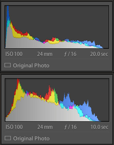
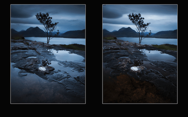
In this case the polariser cuts out all of the blue light reflected on the foreground sandstone. This has two major effects. The first is that it massively increases the contrast of the image. The very bottom of the polarised image is close to black, whilst the sky behind the tree is very light. The histogram is stretched across its full width. The unpolarised image has much lower contrast, with more tones bunched together in the middle of the histogram, and less deep shadow. It’s important when using a polariser to consider this impact on contrast.
The other effect is an aesthetic rather than technical one. The unpolarised version is more luminous with an even blue tone to it. The blue reflections help to define the rocks and puddles. To me there’s an overall sense of tranquility and otherworldliness to this image. There’s even a slight sense that the blue on the rocks is a continuation of the loch below.
By contrast - pun intended! - the polarised version has a much wider colour range and looks more like you would expect (somewhat ironic given the need of a polariser to render it so). It’s still a nice image and the dark towards the bottom could be pulled up in post processing, but there’s a lack of magic and mystery to this image. It lays the scene out before you and leaves fewer questions.
Either version of the image works, but being a big fan of blue and something a little different I much prefer the unpolarised version.
It's All About Position
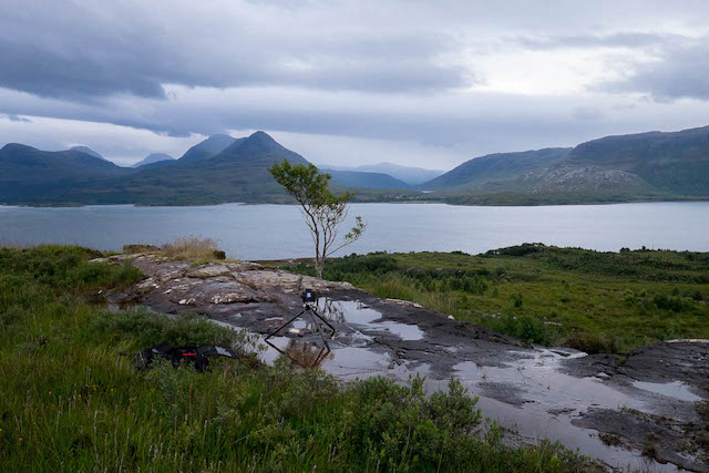
In the set-up shot you can see here how low and close my camera is to the rock and the tree. It doesn't matter how small and scrawny the tree is if you get in close to it.
Even moving just a few inches back greatly diminished (using a 24mm focal length) the tree and also the shape in the rocks. I always find it's really important to push in low and close with a wide angle lens to give the foreground real prominence.
Bruce's Tree
Finally in the name of honesty, I've seen a shot from here before. This is strange given how nondescript this spot seems! I read this post by Bruce Percy last year. At the time I didn't recall the image as being from Torridon. Yet subsequent research whilst I was staying in Torridon earlier this year turned up Bruce's version of this Torridon tree.
Hopefully the other shots I've shown here add weight to my argument that I have made my own image. I think if you were to visit the location yourself, the tree fitting into the gap between the mountains is quite natural, and for reasons above I didn't feel happy with other compositions from here.
It's interesting how different conditions (the light and the water on the rock), different visual interpretations and what must only be small differences in position lead to what I think are quite different images. Even though I talked about getting low and close, it looks like Bruce has gone lower and closer and with a longer focal length than I did (noting that my distant mountains are more expansive).
Nonetheless knowing the similarity to Bruce's image I'm hesitant to include it in my portfolio but think it presents an interesting talking point. I always try to approach my photography with the view to find and do my own thing, and I'm uncomfortable with even a passing similarity. Plus, I think I prefer Bruce's image!


